Thought it would be good to compare the "classic" shirts with the most recent attempt at its design for a comparison. So, the Hull one for example:
Quote classic="hullbg" '"
'"

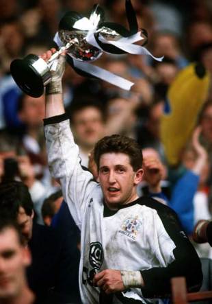
Hull FC 2008 (Challenge Cup Final)
One of my favourite ever Hull shirt is that. It's just what a Hull FC shirt should look like. However, we had a lot of problems with kit clashes that year. You get the odd "know it all" who thinks that just because one shirt has a bit of red on it and another shirt has a bit of black on it that they won't clash if the rest of the kit is blooming white!!!
The back of that Hull shirt is mainly white (so you can see the black number), with white shorts and mainly white socks. So the kit is about 75% white 25% black. But apparently the idiots at the RFL who picked what kits the teams should be wearing in 2008 didn't see the following as a clash:
a 80% white 20% cherry home kit of Wigan (rather than a 99% black 1% white away kit),
or a 90% white 10% black home kit of Bradford (rather than a 90% black, 10% white away kit),
or (the one that REALLY annoys me the most) a 90% white 5% claret 5% gold AWAY kit of Huddersfield (over a 80% claret 10% gold HOME kit that has NO colours that clash with the home kit of Hull at all!).
And people complained that Saints had to wear their away kit in the Challenge Cup Final that year! Idiots!
Since then, Hull have adopted a more black kit to avoid this (as a lot of teams have majority white home kits). We've had black shorts and socks every year since then.